Plugins
On this page
Plugins add React UI to specific places in an apiuikit document. Use them for features such as a request-sending tab, a small action beside an operation, or a control in the document top bar.
Some published packages, are listed on the plugin catalog. This page is the API for installing any plugin and for writing your own.
At a glance#
| If you want to... | Use... |
|---|---|
| Add a full tab to every operation | An *.operation.tab slot |
| Add a small inline control to every operation | An *.operation.reference.supplementary slot |
| Add a control to the document top bar | An *.document.topbar slot |
| Hide, reorder, or replace entire documentation sections | Composable sections, not a plugin |
| Add UI to Vue, Angular, Svelte, or plain HTML | Web Components; plugins are React-only |
The available slots are:
| Slot | Placement |
|---|---|
openapi.operation.tab |
A tab beside the OpenAPI operation's built-in Reference tab |
asyncapi.operation.tab |
A tab beside the AsyncAPI operation's built-in Reference tab |
openapi.operation.reference.supplementary |
Inline after code samples and before authorization |
asyncapi.operation.reference.supplementary |
Inline after the code sample |
openapi.document.topbar |
In the document top bar, alongside search and the markdown export menu |
asyncapi.document.topbar |
In the document top bar, alongside search and the markdown export menu |
Plugins can fill more than one slot. If a plugin does not fill a slot, nothing is rendered there.
Use a plugin#
Install the plugin package, then pass it to the plugins prop:
import { OpenAPI } from "apiuikit";
import requestPlugin from "@yourscope/apiuikit-request-plugin";
import "apiuikit/style.css";
import doc from "./openapi.json";

const plugins = [requestPlugin];

export default function App() {
  return <OpenAPI openapi={doc} plugins={plugins} />;
}
Keep the array stable by defining it outside the component or with useMemo. Creating a new array on every render re-registers the plugins and can reset the selected tab.
You can pass plugins to:
OpenAPIandAsyncAPIOpenAPIRendererandAsyncAPIRendererOpenAPIProviderandAsyncAPIProvider- A standalone section that receives a
documentprop
When a section is inside a provider, it uses the provider's plugins. Its own plugins prop is ignored, just like its own config prop.
<OpenAPIProvider document={doc} plugins={plugins}>
  <OpenAPIServers />
  <OpenAPIEndpoints />
</OpenAPIProvider>
Multiple plugins render in registration order. Plugins currently work only with the React API because the plugins prop contains live component references, which cannot be passed through a custom-element string or JSON attribute.
Write a plugin#
A plugin needs a human-readable name and at least one slot:
import { definePlugin } from "apiuikit/plugin";

export default definePlugin({
  name: "request-sender",
  slots: {
    "openapi.operation.tab": {
      label: "Try it",
      component: RequestPanel,
    },
  },
});
The name appears in error and debug messages and is used as the tab selection ID. It is not a registry key, so duplicate names are accepted, but unique names prevent duplicate tab IDs.
Add a full operation tab#
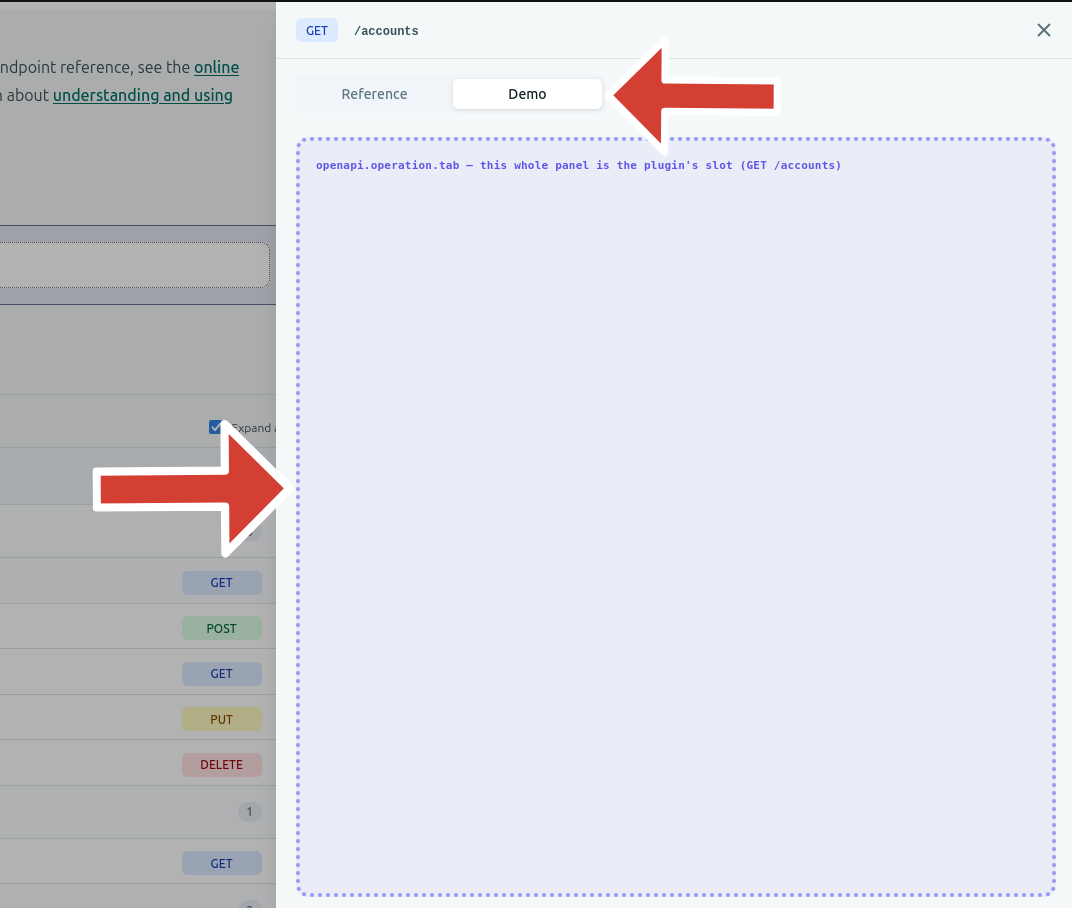
A tab slot takes a label and a component:
export default definePlugin({
  name: "request-sender",
  slots: {
    "openapi.operation.tab": {
      label: "Try it",
      component: RequestPanel,
    },
  },
});
When the user selects the tab, your component replaces the operation panel's entire body. The built-in Reference tab remains first, and plugin tabs follow in registration order. Reference stays mounted while hidden, and each plugin panel mounts on its first visit and then stays mounted, so switching tabs preserves your component's local state. Moving to another operation still resets the selection to Reference.
Add supplementary inline content#
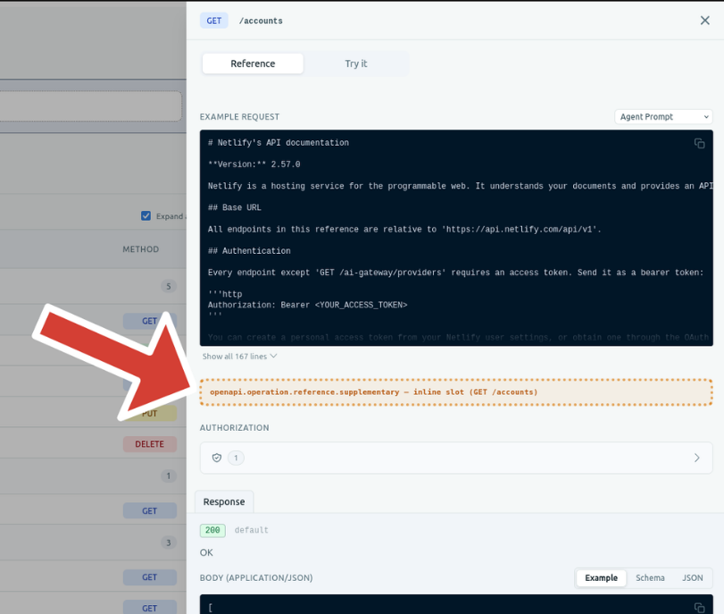
A supplementary slot takes a component directly, without a label:
export default definePlugin({
  name: "copy-operation-link",
  slots: {
    "openapi.operation.reference.supplementary": CopyOperationLink,
  },
});
Use this slot for small, secondary content that complements the operation's built-in Reference documentation rather than replacing it. Multiple plugins filling the same supplementary slot stack in registration order.
Add a document top-bar control#
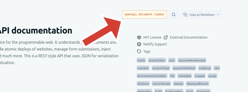
A document top-bar slot takes a component directly, without a label:
export default definePlugin({
  name: "ask-ai",
  slots: {
    "openapi.document.topbar": AskAiButton,
  },
});
Your component renders once per document in the top bar's controls area, next to search and the markdown-export menu. It is not tied to a single operation. Multiple plugins filling this slot stack in registration order.
Read the document#
apiuikit calls your component with the complete document. Operation slots also receive the identity of the current operation. Document-level slots such as *.document.topbar receive only the document — they render once, not once per operation.
interface OpenAPIOperationPluginContext {
  document: OpenAPIDocumentData;
  method: HttpMethod;
  path: string;
}

interface AsyncAPIOperationPluginContext {
  document: AsyncAPIDocumentData;
  operationId: string;
}

interface OpenAPIDocumentPluginContext {
  document: OpenAPIDocumentData;
}

interface AsyncAPIDocumentPluginContext {
  document: AsyncAPIDocumentData;
}
Use the operation identity to find the current operation:
const operation = document.paths?.[path]?.[method]; // OpenAPI
const operation = document.operations?.[operationId]; // AsyncAPI
Here is a complete OpenAPI tab component:
import { definePlugin } from "apiuikit/plugin";
import type { OpenAPIOperationPluginContext } from "apiuikit/plugin";

function OperationSummary({
  document,
  method,
  path,
}: OpenAPIOperationPluginContext) {
  const operation = document.paths?.[path]?.[method];
  if (!operation) return null;

  return (
    <div>
      {method.toUpperCase()} {path}: {operation.summary}
    </div>
  );
}

export default definePlugin({
  name: "operation-summary",
  slots: {
    "openapi.operation.tab": {
      label: "Summary",
      component: OperationSummary,
    },
  },
});
The context does not contain a pre-built bundle of parameters, request bodies, or security settings. Read the values your plugin needs from the document, and for operation slots from the current operation. If the document still contains $ref values, resolve a JSON Pointer with useDocumentContext().deref.
Sending a request#
For OpenAPI, use the published Try it plugin. It is a separately-installed package, not bundled with apiuikit.
To build your own request-sending tab, read the operation's parameters, requestBody, and security fields, then construct a fetch() request or use your preferred HTTP client.
apiuikit does not export a request builder. Its code-sample helper produces snippet-oriented HAR data with placeholders and is not designed to execute requests.
The same approach can be used with asyncapi.operation.tab, but apiuikit does not currently provide an equivalent recipe for WebSocket, Kafka, or MQTT requests.
Match the document theme#
Plugin components inherit the host document's CSS custom properties. Use them instead of hardcoding colors:
const sendButtonStyle = {
  background: "rgb(var(--color-primary-600) / 1)",
  border: "1px solid rgb(var(--color-border) / 1)",
  color: "#fff",
};
Available variables include:
--color-primary-{50,100,200,300,500,600,700}--color-secondary-{50,100,200,300,500,600,700}--color-neutral-{50,100,200,300,500,600,700}--color-background,--color-surface, and--color-border--color-text-primary,--color-text-secondary, and--color-text-muted
Each variable contains RGB channels such as "31 111 235". See Configuration for theme options.
For other settings, useDocumentContext().config exposes the raw ConfigInterface. Prefer resolved context fields such as showCodeSamples and deref when they are available.
Error handling#
Each plugin instance has its own error boundary and Suspense boundary. A broken or slow plugin cannot take down the document or another plugin.
If a plugin throws during rendering, apiuikit skips it and logs an error in this format:
[apiuikit] plugin error in slot "...":There is currently no user-facing fallback for a failed plugin.
Plugin API reference#
Import the plugin API from apiuikit/plugin:
import { definePlugin } from "apiuikit/plugin";
import type { OpenAPIOperationPluginContext } from "apiuikit/plugin";| Export | Purpose |
|---|---|
definePlugin(plugin) |
Returns the plugin unchanged and types it as ApiuikitPlugin |
ApiuikitPlugin |
The complete plugin object type |
OpenAPIOperationPluginContext, AsyncAPIOperationPluginContext |
Props passed to an operation slot component |
OpenAPIDocumentPluginContext, AsyncAPIDocumentPluginContext |
Props passed to a document-level slot component, such as *.document.topbar |
HttpMethod, OpenAPIDocumentData, and related OpenAPI types |
Types for reading an OpenAPI operation and its data |
AsyncAPIDocumentData |
Type for reading an AsyncAPI operation |
useDocumentContext() |
Access to deref, configuration, and other ambient document state |
ConfigInterface, ThemeConfig, and related theme types |
Types for the host configuration |
For custom UI that hosts APIUIKit plugin slots itself (most plugin components do not need this): PluginSlot, PluginSlotEntry, PluginSlotProps, usePluginSlot, useOperationTabPlugins, PluginTabEntry, PluginSlotName, SupplementarySlotName, TabSlotName, PluginSlotContextMap, PluginSlotComponent<N>, PluginTabSlotFill<N>, and the spec-narrowing useOpenAPIDocumentContext() / useAsyncAPIDocumentContext().
Publish a plugin#
Publish the plugin as its own package. Declare apiuikit, react, and react-dom as peer dependencies:
{
  "name": "@yourscope/apiuikit-request-plugin",
  "peerDependencies": {
    "apiuikit": "^1.5.0",
    "react": ">=18",
    "react-dom": ">=18"
  }
}
Pin apiuikit to the major and minor version you developed against.
Mark these imports as external in your bundler configuration:
apiuikitapiuikit/pluginreactreact-domreact/jsx-runtime
This is required for correct React context behavior, not just a smaller bundle. Bundling another copy of apiuikit creates a separate DocumentContext. In that case, useDocumentContext() can report that it must be used within a document provider even when the plugin is correctly nested inside one.